

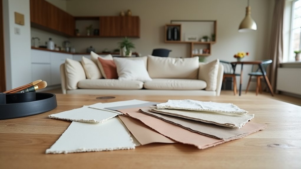
You can’t pick a whole-home colour scheme by guessing from a paint chip. Start with one anchor you already love—your sofa, a rug, or standout art—and pull 2–4 workable hues from it. Then match each room’s mood to those colours, and check how daylight and bulbs shift them across your walls. Before you commit, you’ll need a simple way to keep everything cohesive without looking matchy…
Pick Your Colour Scheme Starting Point

Whether you’re invigorating one room or planning a whole-home update, start by choosing a single “anchor” for your colour scheme—something you already own or plan to buy that you won’t swap out soon, like a sofa, rug, artwork, or countertop. Pull two to four hues from that anchor and treat them as your fixed palette, so every new purchase reinforces it and you avoid costly do-overs.
Use Color psychology at this stage only to sanity-check the vibe you’re signaling (fresh, grounded, luxe), not to assign room-by-room moods.
Then map your palette to paint finish choices that protect resale value: matte for ceilings, washable eggshell for most walls, satin for trim, and semi-gloss where durability matters. Test large swatches in your lighting before committing.
Choose Interior Colours for Each Room’s Mood
Once you’ve locked in your core palette, you can fine-tune each room’s mood by shifting the balance of those same colours—more light and air for productivity, more depth and warmth for rest, and cleaner contrast for focus.
In your kitchen and home office, push crisp whites, pale greys, or cool greens to signal clarity and momentum; keep saturation low so surfaces feel streamlined and resale-friendly.
For bedrooms, lean into muted blues, warm taupes, or clay tones and soften contrast to cue recovery through Color psychology.
In living areas, use mid-tone neutrals plus one confident accent to support conversation without visual noise.
Bathrooms benefit from spa-like hues and tidy contrast.
Always check Cultural influences in your household—symbolic colours can boost comfort or create friction.
Read Natural Light Before You Choose Colours
Because daylight changes colour temperature and contrast more than any paint chip ever will, you should read your home’s natural light before you commit to a scheme. Track each room at morning, midday, and evening; note whether light skews cool (north) or warm (south) and how shadows fall. Tape large colour samples to multiple walls, not just one, so you see bounce light and glare.
Factor in wall texture, since matte plaster, brick, or heavy orange-peel can mute colour and deepen shadows, while smooth drywall reflects more evenly. Check finishes beside your fixed elements—flooring, stone, metals—so colour coordination stays profitable and intentional.
View everything under your actual bulbs at night; mixed LEDs can sabotage your picks fast. Photograph tests for objective comparisons, too.
Build a Whole-Home Interior Colour Palette
Now that you’ve seen how each room’s daylight and bulbs shift colour, lock those insights into a whole-home palette that keeps your spaces cohesive and resale-friendly.
Start with one versatile neutral for main walls, then pick a second neutral for trim and cabinetry to add crisp contrast.
Layer in one to two accent colours that repeat across rooms in textiles, art, and décor for a “designed” look.
Use Colour psychology insights to steer choices: calm blues for bedrooms, warm greiges for living areas, and fresh greens for kitchens and baths.
Keep undertones consistent (all warm or all cool) to prevent visual clashes.
For Accent wall ideas, choose one focal wall per level, tied to existing finishes, so you add character without overcommitting.
Test Paint Colours So They Stay Timeless

Before you commit to gallons and labour, test your shortlisted paint colours the same way a future buyer will experience them—in real light, on your actual surfaces, across the full day. Paint large swatches (or stick-on samples) on multiple walls, including near trim and cabinetry, because undertones shift against fixed finishes. Check morning, midday, and evening light, then view from the doorway to mimic first impressions.
Use Color psychology to confirm the mood matches the room’s function: calm for bedrooms, clean for kitchens, welcoming for entries. Don’t ignore paint finish options—flat can hide flaws, eggshell suits living areas, satin handles wipe-down zones.
Finally, photograph samples next to your key furnishings; the camera reveals clashes your eyes forgive.
Frequently Asked Questions
How Do I Coordinate Paint Colours With Existing Furniture and Flooring?
Start by matching paint undertones to your flooring, then pull two hues from your largest furniture. Aim for color palette balance: one dominant, one secondary, one accent. Test swatches nearby for furniture color harmony.
Should I Repaint Trim, Doors, and Ceilings to Match the New Scheme?
Yes—you should, for cohesion and resale value; 60% of buyers notice paint details first. Repaint matching trim, door colors, and ceilings when shifting palettes; keep ceilings bright, trim semi-gloss, and doors consistent throughout.
What Paint Finish Is Best for Walls in High-Traffic Areas?
Choose satin or eggshell for high-traffic walls; they’re durable, washable, and touch up well. Use paint application techniques like proper priming and rolling, and lean on color psychology to hide scuffs while selling your style.
How Can I Keep an Open-Plan Space Cohesive Without Looking Monotonous?
You’ll avoid monotony by linking zones with one bold anchor hue, then wildly varying textures, tones, and materials. Use color psychology for mood shifts, and nail lighting considerations with consistent bulbs, layered fixtures, and strategic accents.
When Should I Hire an Interior Designer Instead of Choosing Colours Myself?
Hire an interior designer when you’re juggling complex layouts, tight deadlines, or resale goals and can’t risk mistakes. Weigh budget considerations: DIY vs professional. If samples overwhelm you or costs escalate, bring expertise.